Engagement
User engagement measures how users find value in a product or service. Engagement can be measured by a variety of activities such as clicks, shares, and more. Highly engaged users are more likely to contribute to stronger growth because they are more likely to share the product or service with their network.
Engagement should be defined by value, not just usage
How do you define your product’s value moment so that you can measure engagement accordingly? One common strategy is to track every single user event, come up with an array of metrics, and consider them all equally. This can give a false sense of how many active users you have and how often they receive value from your product.
Let’s say you have a delivery app. Is every login, settings change, and menu click a value moment? If not, it may be easier and more effective to prioritize a single value moment to track, like “completed order.”
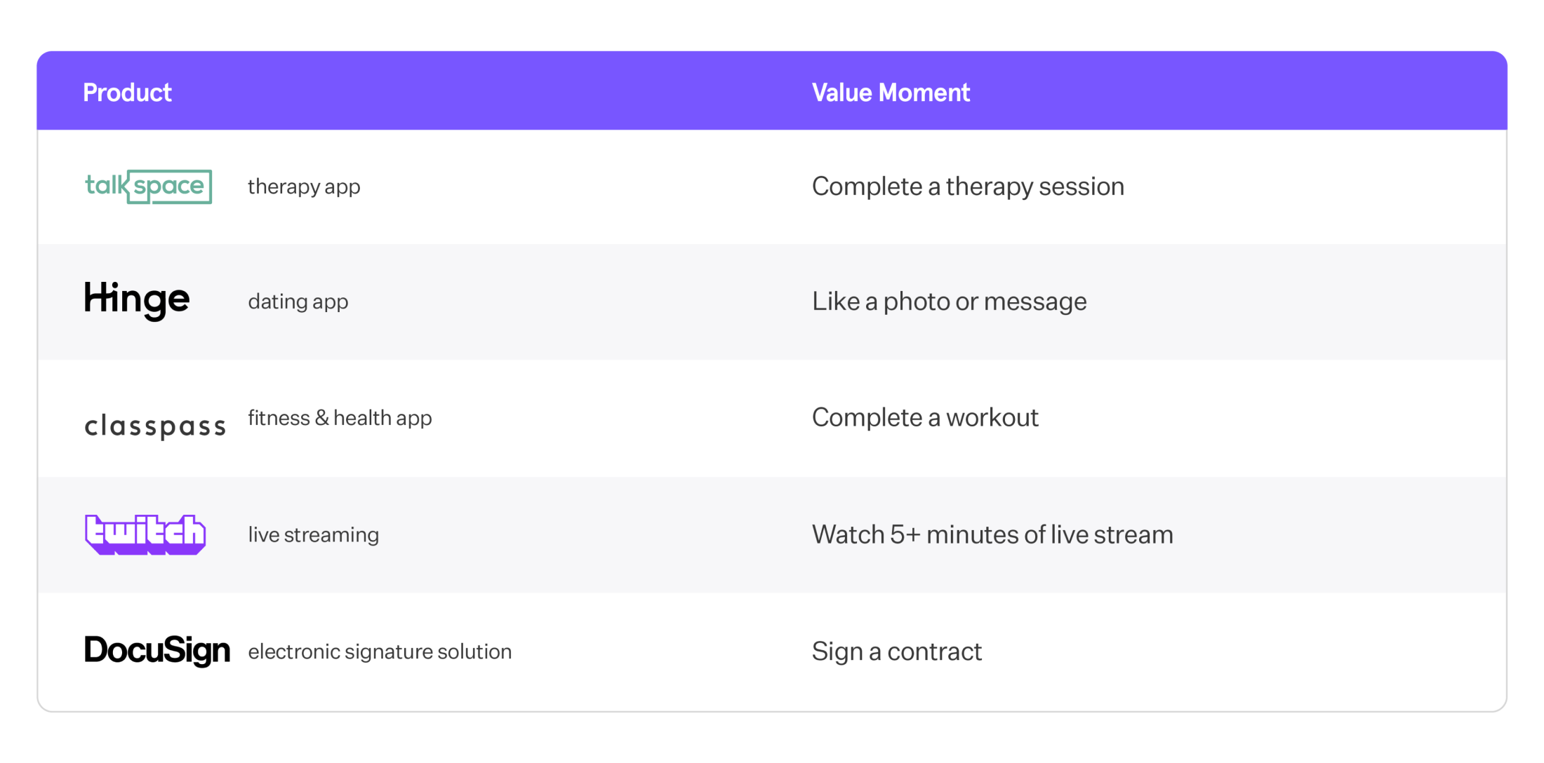
Prioritizing a single value moment is hard, but it’s a more straightforward way of gauging the value that your product brings to market. Value moments will look different for different products and industries, but here are some examples to help you assess what your product’s unique value moment is:

Pro tip: Though your retention numbers might initially decline if you are no longer considering every single user action a valuable moment, in the long term, retention and value are intrinsically the same. So, focusing on value at all times is a surefire way to prioritize long-term retention.
How do I… see how many users experience value in my product?
Now that we’ve defined our value moment, we’ll want to understand how many users experience value in your product each day, and how often.
See how many users are finding value in your product with the Company KPIs Template (opens in a new tab).

If you’re a media streaming app, your product’s value moment might be “watch video.” In this chart, you can see the unique number of users as well as the total number of value moments across all users. “Unique” counts each user once—regardless of where they watched a single video or five—while “total” count every time a video was watched across all users. By seeing both, you can observe how many individual users experience value and what timeframe they are reaching that value moment.
How do I… see who my most engaged users are?

You can identify your most engaged users by using cohorts. Cohorts are a group of users defined by a chosen set of criteria—in this case, users who have reached the value moment three times in the last month. (P.S. If you click in and see this cohort in the “Users” page, you’ll see the full list of user names and emails). This chart uses an auto-generated cohort of your “engaged users” by grouping users who have performed your product’s value moment—in this case, “watch video”—at least 3 times a week.
Mixpanel’s Company KPIs Board template automatically creates a report with a ready-made cohort of your most engaged users. Try it for free here (opens in a new tab).
While the Company KPIs Board template is designed to do the heavy lifting for you, it’s easy to find your product’s power/core/casual users on your own. Here’s how:
- In the Insights report, select an event that you define as your value moment (e.g., “watch video”).
- Highlight “Unique Users” to bring up all the different ways you can group your users. Select “total per user.”
- Select your level of aggregation. Median (50th percentile) will be your core users. 90th percentile will be your power users. 25th percentile will be your casual users. By highlighting the line graph, you can view how many videos each group typically watches hourly, daily, weekly, or monthly.
- Customize the date range. Mixpanel will default your line graph over time to a look back of the last 30 days (from the active day) and a day-by-day count.
What is the right definition of power/core/casual users for my product?
In our media streaming example, it stands to reason that the more videos people watch (daily, weekly, monthly), the more active they are. This is helpful information to figure out which users are valuable and which ones are likely to churn. However, there are more dimensions of user behavior you can take into account:
Frequency
Tracking frequency can help you categorize users. For example, if your users come back weekly, you could define the following:
- Power User: 6 out of 7 days
- Core User: 3 out of 7 days
- Casual User: 1 out of 7 days
Breadth
The way people utilize features can define user activity. For example, if you offer a ride-sharing product:
- Power User: uses economy, deluxe ride-sharing, and vanpool option
- Core User: uses economy and vanpool
- Casual User: only economy ride-sharing
When a company extends its products beyond the core use case (e.g., a ride-sharing company adds food delivery), you can measure the breadth of usage based on the number of unique product offerings users have tried.
Depth
For a video streaming app, a depth metric might be the number of videos watched, the number of minutes spent watching videos, etc. For a marketplace platform, it might be the total dollars spent.
The dimension you end up picking depends on how people get the most value out of your product and what’s correlated with engagement and long-term retention of your users.
How do I… determine how many users are getting to a value moment?
Next, let’s find your product’s activation rate, which shows how quickly and effectively users are getting to a predetermined value moment within a set period of time. We can find ours by measuring how many users are going from your “sign up” (or “session start”) event to your value moment event within a given timeframe.

The Funnels report allows us to look at behaviors performed in a series. It’s how we build “conversion” or “completion” metrics and quantify the overall health of any customer acquisition strategy.
In the query builder, we add the behaviors, or steps, in a user journey we wish to measure in order—in this case, our signup event and our value moment event. The “conversion window,” the amount of time that each user has to complete all these actions in order to count at each step, is set to 30 days.
The funnel shows that in the last 30 days, 75.34% of users who signed up went on to watch a video within 30 days. You can also see that it took an average of 6.8 days for users to watch a video after signing up. That’s valuable intel if you’re trying to tighten that window and help users find value even sooner.
Discover your product’s activation rate in just a few clicks with the Company KPI Template. Try it here or sign up for your free Mixpanel account.
What is my product usage interval?
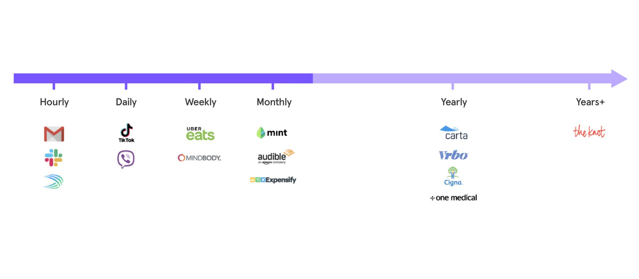
To group your users based on how engaged they are, you need to know how frequently they typically use your product. Daily? Weekly? Monthly? Every few months?
With popular “concierge medicine” apps like One Medical, Forward, or Parsley Health, the key value proposition is the convenience of booking medical appointments; so somebody who books an appointment once every six months on may well be “very active.” And somebody who books an appointment every year could still be considered “quite active.”
Now, let’s look at the other extreme—a social media app like TikTok. The value moment here might be watching a video and “hearting” it. Every day, a typical “active” user can “heart” 10, 20, even 30 videos. That’s a far cry from once a year!
In short, there’s no standard “good” product usage interval, and you will need a combination of product intuition and product analytics to figure out the right one for your product.
Reforge pioneered this way of thinking about product usage intervals with their “habit zone” framework.

How do I…see what happens to users who don’t reach the value moment?
As important as it is to understand your users who do convert, it’s also important to understand the users who don’t. Where did things go awry? Was it simply a session end? Did they do something else in your product instead? What was their journey?
Users often go outside the user journeys product teams build for them. Maybe they ultimately do reach their value moment, but in a roundabout way that you never imagined. You may have only optimized for one user journey, but your data may very well be telling you to optimize for multiple paths to value—or perhaps a different one altogether.
In Mixpanel, you can easily move from a Funnel to our Flows report to better understand the users who don’t reach their value moment. The report will surface hidden insights about other common user journeys so you can optimize accordingly.

The Flows report is an alternative to Funnels and is useful when you don’t know the exact path your users take to arrive at some destination, and you want to map out all possible journeys. In Flows, once we choose a couple of key milestones in our user journey, we’ll be able to unfold their behaviors in-between specific anchoring steps.
The first step of our flow is our signup event and the last step is our value moment, “watch video.” Because our query is set to “1 step after” the first event and “1 step before” the last, we can see what users most commonly did immediately following the signup event and immediately before reaching their value moment. It looks like most users subscribed to a channel and then liked a piece of content before reaching their value moment.
Where can I learn more?
- Read our Primers on Retention and Growth to learn why those metrics matter, what they mean, and how to measure them.
- Take our Company KPIs Board Template (opens in a new tab) for a spin to start measuring and optimizing your product’s engagement with only two events and four easy clicks.
Was this page useful?